
Having a responsive and adaptive website across all platforms and devices is essential for online businesses to maintain a consistent user experience. This becomes even more important with Google’s new requirement to ensure sites work flawlessly on mobile devices. Transitioning from desktop to mobile means choosing best mobile WordPress plugins to provide an optimized experience for users on any device.
Depending on the business needs, several different types of plugins are available. Some may want a complete mobile site, while others might only require a method for improving the existing website menus or layouts for all devices. Whatever the case, the top 9 mobile WordPress plugins that can quickly transform websites into touch-friendly versions without needing extra coding knowledge are available. By comparing their features, businesses can select the plugin that will give them the most optimized mobile version of their website.
Locating appropriate mobile WordPress plugins can be a difficult challenge. With so many solutions out there, finding one to fit your site doesn’t have to be an arduous task; with some trial and error you can determine which plugin best meets your needs and that of your website. By installing multiple plugins onto your WordPress site and testing out their features one at a time you can narrow the field quickly down.
At first glance, most popular mobile WordPress plugins seem similar. However, their true differences lie beneath the surface – pay attention to user interface, responsive elements on all devices, customization ease and mix-and-match potential before making your decision. In-depth reviews online may give insight into what features should be prioritized when searching for mobile plugin solutions.
Mobile optimization is a must in today’s digital world. Having your website display correctly on mobile devices could prevent visitors from missing critical information or giving up entirely. While some WordPress themes come designed with mobile-friendly designs, others don’t. This is where mobile WordPress plugins can be helpful.
A WordPress mobile plugin is an adaptation tool for your website so that it looks good no matter what the device. It detects what type of device the user is viewing the website from and automatically adjusts accordingly for optimal viewing pleasure and more straightforward navigation. The plugin allows you to make minor adjustments to fonts, colors, spacing, images, columns, and other design elements, all from within the dashboard for quick implementation. You can create an aesthetically pleasing version of your web page on any device with little effort.
WPtouch is a powerful plugin designed to enable website owners to quickly and effortlessly convert their WordPress website into a mobile-friendly interface, so visitors can access their site without issue on mobile devices such as phones and tablets. Furthermore, with its accessible version, your desktop website design remains intact while still having an optimized mobile version optimized specifically for smaller devices like phones and tablets. WPtouch automatically factors in Google Mobile Test so no longer do you have to worry if your site passes it – WPtouch ensures it does!
WPtouch’s use isn’t limited to WordPress sites – it can also help optimize any website for mobile devices. Not only does WPtouch produce quick and stylish versions of existing websites that work perfectly on small screens without the need for coders or special knowledge to implement it, but it also preserves SEO rankings from desktop pages so you don’t lose valuable traffic due to lost SEO rankings. Overall, using WPtouch ensures visitors enjoy an engaging browsing experience no matter which device they view it from – be it desktop or mobile!
WPtouch is one of the top mobile WordPress plugins available today, making switching existing themes to mobile-friendly ones with just one click simple and user-friendly. Their Pro Version offers additional beautiful themes and extensions tailored for various website types at reasonable costs; their Settings page on WordPress makes navigating how the plugin works even simpler!

JetPack is an impressive all-in-one mobile WordPress plugin that can greatly improve the experience for visitors to your website in many areas, including security, marketing growth, SEO analytics and performance. These helpful features can save time while improving overall website experience.
One of JetPack’s key advantages lies in its speed and performance enhancements, such as its content delivery network (CDN) for images, static files such as JavaScript and CSS files, lazy loading ideas to increase page loading speeds, as well as its ad-free high speed video hosting capability.
Also included is a custom site search system to assist users in quickly finding what they need. Jetpack also comes equipped with several additional features, such as unlimited automatic backups in case anything goes wrong, malware scanning and code repair services should they become necessary, plugin auto-updates, site stats that help you understand your audience better over time, auto publishing content to social media websites such as Facebook or Twitter, payment processing using PayPal or Stripe for monetization opportunities and much more – making Jetpack an invaluable capacity-building solution! As it can be seen, Jetpack boasts plenty of capacity-building abilities.
At the core of successful website design lies engaging images. Not only will engaging images increase user experience and conversion rate, but their large file sizes may bog down site speed, causing negative user experience. Smush is an image compression and optimization plugin for WordPress that helps reduce visual effects on page speed without compromising quality.
Once installed, this plugin will automatically compress up to 50 photos uploaded at once when newly uploaded, reducing them in size to not significantly impact page speeds while still working well on mobile devices. Furthermore, additional features such as removing unnecessary colours from indexed images and setting maximum width and height constraints allow images to be quickly rescaled are included allowing for high conversion rates while maintaining quality images with fast loading times and optimal user experiences, resulting in increased sales conversions.
AMP for WP is an indispensable plugin that provides a mobile website version of your WordPress site, making it compatible with multiple devices and platforms with minimal effort required to switch themes. Once installed, this plug-in transforms content into fast-loading, accelerated mobile pages; perfect for when people require information quickly on the go.
Utilizing the AMP for WP plugin offers several great features to assist visitors in navigating around your website more quickly and smoothly. Navigating between pages is effortless thanks to its dynamically generated navigation bar, making content easily searchable in seconds. Plus, Google Analytics tracking capability lets you measure viewership success and generate potential ad revenue returns – plus, there are no costs involved as its core plugin itself is completely free!
The WordPress Mobile Pack is an excellent solution for businesses that want to create mobile interfaces for their websites that look and feel like an app. It’s important not to get confused by the term “app,” as these are just standard HTML web pages optimized and accessed from a mobile device. The Mobile Pack offers features such as push notifications, animations, and the ability to choose between templates that mimic an iPhone or Android app user interface. This helps create a more inclusive user experience regardless of the device used.
In addition to the HTML interface, WordPress Mobile Pack includes tools like server configuration to optimize page loading speeds and compatibility tests across multiple devices. This pack aims to give businesses the power to make their website fully optimized for mobile users while creating an intuitive and attractive design similar to native apps. Tools like AppPresser can even be combined with the WordPress Mobile Pack to make your site available as a real downloadable app on iOS or Android stores for those who don’t necessarily want one from scratch.
Touchy is a WordPress mobile menu plugin that makes navigating your website on mobile devices simple. From keeping elements from its desktop version intact to creating entirely new designs for smaller screens, Touchy gives you full control over its appearance on smaller devices.
Touchy plugin enables users to reorganize their website’s navigation into an intuitive, responsive design that works great across all smartphone devices. Furthermore, this unique functionality gives them access to arrange links in various ways, including creating menus with attached images and icons for better recognition. In addition, keyboard shortcuts make navigation simpler while its comprehensive CSS editor helps developers make significant adjustments without constantly tweaking code – Touchy further accelerates speed by providing access to preconfigured themes for fast results.
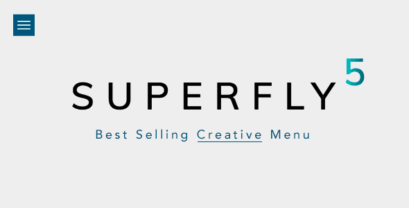
No matter if you’re creating a blog, e-commerce site, or anything else, Superfly’s WordPress menus provide users with easy navigation from desktop and mobile devices in just a few clicks. As a responsive plugin, Superfly automatically adjusts its functions so they look beautiful on any device it is being used on while also offering plenty of customization so you can tailor navigation according to the feel of your site without too much effort; styling options include enhanced mobile support and control for different pages on the menu structure – plus plenty more.
Navigation should never be neglected when crafting an excellent user experience; Superfly ensures your menus adhere to today’s standards while giving you complete freedom in customizing them to meet any need or request. Plus, its cross-browser compatibility means customers browsing your site on desktops or mobiles will always find what they’re searching for quickly and without difficulty; its presets make the process quicker than ever!
Max Mega Menu is an indispensable plugin for WordPress users looking to quickly create intuitive navigation menus with multiple pages. This plugin does a fantastic job of turning any existing WordPress menu into an efficient mega menu that displays all page options easily and allows visitors to quickly find what they’re searching for on any browser, be it mobile, PC or Mac. Furthermore, its extensive testing ensures your navigation still displays all pertinent data clearly no matter which interface visitors may use to access your website.
With its convenient drag-and-drop menu builder feature, the Max Mega Menu plugin makes coding unnecessary to implement and gives users complete control over their custom design. Thanks to this reliable tool, anyone can quickly set up, customize, and update WordPress menus without hassle or bother from mobile versions of websites anymore, giving developers more time and energy for other essential tasks, like content optimization.
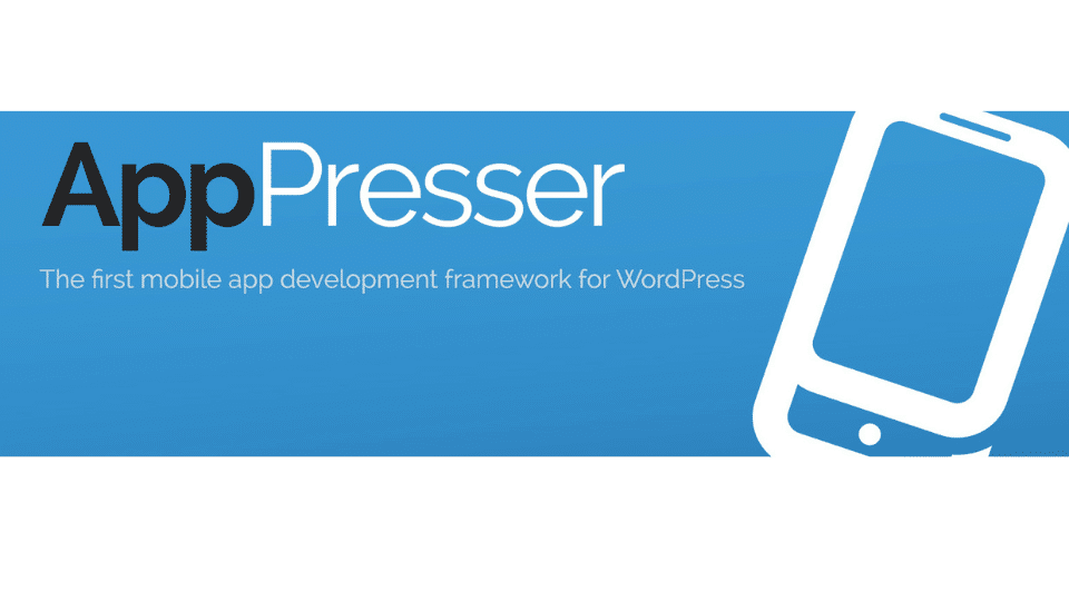
AppPresser is an innovative plugin that allows users to create real apps for their WordPress website instead of relying on a primary RSS feed. This plugin integrates native app features such as push notifications and access to native device data like contacts and calendars seamlessly into the website. It also allows you to build custom content for your app to ensure it stands out from the competition. With AppPresser, you can create an Android or iPhone app and link it to your WordPress site, allowing complete development process.
That being said, remember that AppPresser is mainly designed with experienced web builders in mind. Professional support and services are available through the AppPresser team if you encounter issues while using the plugin. That way, if you’re a complete beginner in app building, they have your back every step of the way!
What is a mobile plugin?
A mobile plugin in WordPress is an add-on or extension that makes your website work better and look better when it’s viewed on a mobile device.
How do I make my WordPress site mobile-compatible?
To make your WordPress site work on mobile devices, you can start by picking a responsive theme whose layout changes depending on the size of the screen.
Are mobile plugins compatible with all WordPress themes?
Most mobile plugins are designed to work with a wide range of WordPress themes, but it’s a good idea to check compatibility before installing one.
Are WordPress sites mobile-friendly?
Yes, WordPress sites work well on mobile devices by default. Additionally, you can make sure that your website looks good and works well on mobile by choosing a responsive theme, optimizing images, and using mobile plugins.
How can I increase the speed of my WordPress site on mobile?
To boost the speed of your WordPress site on mobile, start by optimizing images, minimizing CSS and JavaScript files, and using a caching plugin.
Are there any SEO benefits to using mobile plugins?
Yes, having a mobile-friendly site can improve your SEO efforts, as search engines like Google prioritize mobile-responsive websites.